ShopDreamUp AI ArtDreamUp
Deviation Actions


Badge Awards
Description
Facebook -- www.facebook.com/pages/Tsukiko…
Instagram -- instagram.com/alexandrahaynak
Society6 -- society6.com/tsukikokiyomidzu
Instagram -- instagram.com/alexandrahaynak
Society6 -- society6.com/tsukikokiyomidzu
Image size
700x700px 354.31 KB
© 2015 - 2024 tsukiko-kiyomidzu
Comments277
Join the community to add your comment. Already a deviant? Log In
This is with no doubt an outstanding piece of art. Since the first glance, it catched my eye and didn't want to let it go.
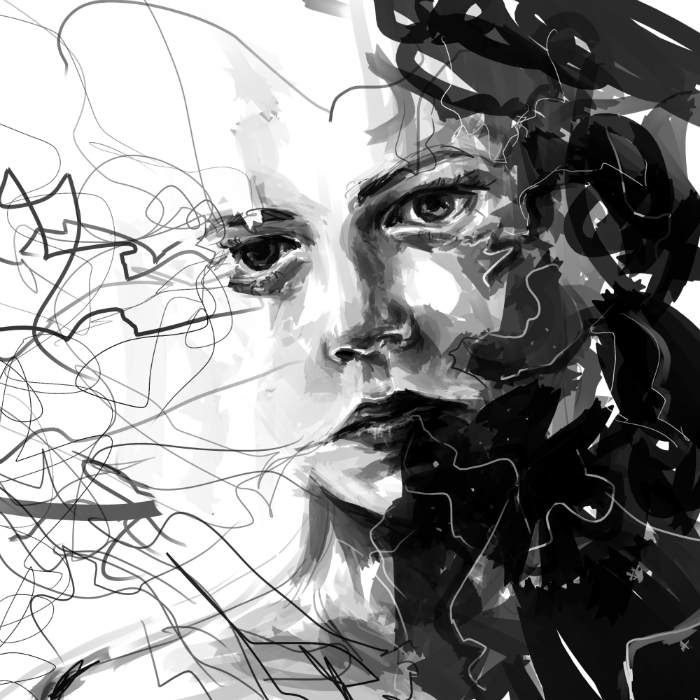
Vision: It is hard to decide whether this artwork is meant to express anxiety or to create it. From my point of view, it does both, and it accomplishes them equally. The face of the woman actually shows little emotion, even though she has this piercing gaze. The power of the idea is expressed through the strong and random brush strokes rather than the actual face. Those black strokes on the right side seem to be "eating" her, as if the emotion were devouring her emotional balance. It is indeed a good way to show what you want to show. I've nothing to complain about this aspect.
Originality: Greyscales and faces being "devoured" by thoughts are nothing new, but the way you made this piece gives it a fresh touch and makes it entertaining. I don't feel bored looking at this, and that's what this is about: here, you took a conventional style and gave it your own touch, resulting in something interesting and goodlooking.
Technique: Here comes the parts I don't like that much in your work. Since it is hard to create a proper painting using random I have to say you actually did it well, but I'd change a few things. The top right corner looks a bit odd as if there isn't a perfect transition from the white side towards the dark one. Here, I'd apply a few lighter tones of grey. Besides, I'd fill a little those white gaps on the right border, since there's a significant difference between the middle-upper part and the lower part and it somehow distracts the viewer's attention. (For you to understand what I mean, try to hide the right white gaps with your hand and see how it looks like when the border is darker)
Impact: Last, but not least. I have to say you achieved this one well. Your art is intended to evoke emotions on the viewer and it definitely does. The viewer has to think twice and stare at the piece for awhile in order to understand how he or she feels about it and catch the idea of the painting.
(On a side note, I wish I made myself clear enough, since English is not my main language and it is hard to find the right words. Anyway, I enjoyed "Anxiety" and found it to be such an interesting piece)